
CASE STUDY:
Redesigning the
National Art Gallery
Digital Experience
The redesign of the National Art Gallery’s website and the creation of a mobile application aim to provide a seamless and user-friendly digital experience for art enthusiasts and visitors alike. These revamped platforms allow users to explore everything the gallery has to offer — from current, upcoming, and past exhibitions to featured events and permanent art collections. Users can easily discover detailed information, plan their visits, and make ticket reservations in advance. Whether planning an in-person visit or discovering masterpieces from home, the platforms ensure seamless access to exhibition and event updates, enhancing the public accessibility and engagement with art.
PROBLEM STATEMENT
Outdated website with poor user experience
The National Art Gallery's existing website has an outdated interface and is confusing to navigate, leaving users frustrated and disengaged. There's no way to book tickets online, no mobile app for on-the-go access, and minimal digital promotion of exhibitions or events. As a result, many potential visitors are unaware of what’s happening—and have no easy way to plan a visit.
.png)


.png)
.png)
OBJECTIVES & GOALS
To redesign website and create a mobile app with a modern, user-friendly interface
This project aims to modernize the National Art Gallery’s digital presence by redesigning the website for better usability and navigation, adding online ticket booking, and creating a mobile app for on-the-go access. It also seeks to improve how exhibitions and events are promoted online, making it easier for the public to stay informed and engaged. The overall goal is to create a seamless, user-friendly experience that boosts visitor satisfaction and increases attendance.
SOLUTION
Redesign the National Art Gallery’s website for better usability and navigation
-
Redesign the existing website to improve visual appeal and usability
-
Improve information architecture and navigation for easier access to exhibitions, events, and visitor info
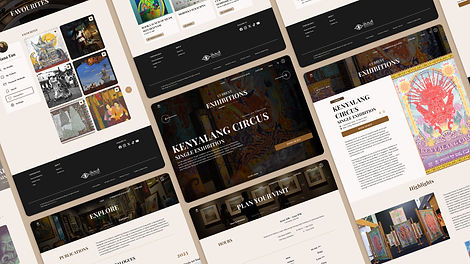
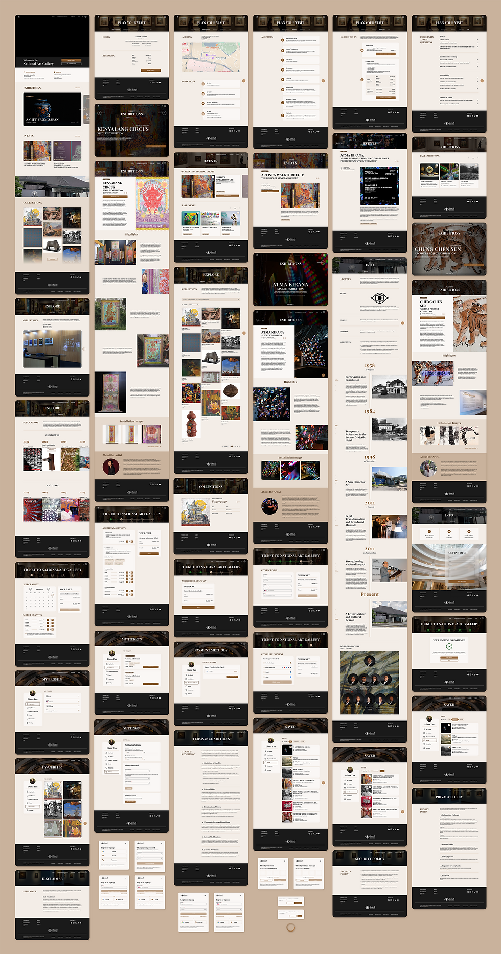
Streamlined homepage with intuitive navigation
The redesigned homepage serves as a welcoming gateway with a clean layout, clear hierarchy, and prominent calls-to-action. It directs users to key areas of the site, such as visit planning, exhibitions, and ticket booking—minimizing confusion and helping both new and returning visitors find what they’re looking for quickly.
A visit page that simplifies trip planning
To assist users in preparing for their gallery visit, I designed a dedicated Visit page that compiles essential information such as opening hours, ticketing options, location, amenities, guided tours, and FAQ. This reduces friction and empowers users to plan their visit confidently and efficiently.
A central hub for exhibitions and events
The Exhibitions & Events page allows users to easily explore current, upcoming, and past events. With clear categorization and visual previews, visitors can find exhibitions that interest them, revisit previous events, or plan ahead for what's coming next.
Explore page to deepen user engagement
To encourage discovery beyond exhibitions, I created an Explore page where users can browse permanent art collections, explore gallery publications like catalogues and magazines, and learn more about the gallery shop. This helps users connect with the gallery in multiple meaningful ways, both during and beyond their visit.
Info page for gallery background and contact
The Info page consolidates essential information about the gallery’s background, history, and contact details. This improves transparency and offers visitors a reliable resource for learning more about the institution.

Add an online ticket booking system to reduce visitor friction and support pre-planning
-
Introduce an online ticket booking system to streamline the visitor journey and encourage pre-visit planning
Enhancing visit planning through online ticketing
To reduce friction and support better visitor planning, I introduced an online ticket booking system. This feature allows guests to reserve tickets ahead of time, easing entry logistics while giving the gallery valuable data insights, such as peak times, visitor demographics, and popular exhibitions, for more informed planning and improved operations.
Design a mobile app to reach mobile-first users and expand accessibility
-
Provide greater accessibility for users who prefer browsing on their phones
-
Offer access to key features and content on the go


Introduce personalized user account system to enhance user engagement
-
Visitors can create an account to receive timely notifications about upcoming exhibitions, events, and gallery updates
-
Users can also “save” events they are interested in and “favourite” artworks they enjoy
DESIGN PROCESS
Difficulty Finding Key Information Due to Poor Navigation
Pain points
Low Awareness of Upcoming Exhibitions and Events
Lack of Clear Calls to Action (CTAs)
Poor Mobile Experience
EMPATHIZE
User interviews
I conducted a series of user interviews with 5 participants with varying backgrounds during the Empathize phase of the design thinking process. These interviews aimed to uncover how users interact with the existing digital platform and identify usability pain points. Each interview session was semi-structured and open-ended questions were asked about their goals, challenges with the current website, and suggestions for improvement. Sessions were conducted both in-person and via survey forms.
For this project, I will focus on analyzing and developing two distinct user personas, based on insights gathered from user interviews conducted during the case study. These personas, along with their corresponding user journeys, will guide the design process to ensure it effectively addresses the real needs, behaviors, and goals of representative users.
User Personas


User Journey Maps


DEFINE
In the Define phase, I synthesized key research findings to clearly identify and articulate the core user needs and usability challenges with the National Art Gallery’s current website. The goal was to create a seamless, user-centered experience that boosts user satisfaction, encourages repeat visits, and increases public attendance—making the gallery more accessible and engaging for all.
Problem Statements


Project Goals
The goal of this project is to enhance the National Art Gallery’s digital experience by addressing key usability challenges and meeting user needs. This includes:

-
to improve navigation, usability, and access to essential visitor information
Redesign the website
-
to streamline planning and make visits more convenient
Introduce online ticket booking
-
to provide seamless, on-the-go access to exhibitions, events, and gallery information
Create a mobile app
-
to ensure users stay informed, engaged, and inspired to visit
Improve the visibility
and promotion of
exhibitions and events
IDEATE
In the Ideate phase, I began generating potential solutions based on the key user pain points and needs defined in the previous phase. This stage involved brainstorming and analysis of existing digital experiences. I aimed to identify innovative yet practical ideas to guide the redesign of the National Art Gallery’s digital presence.
To frame and inspire meaningful solutions, I used two primary methods:
-
A Competitive Audit to evaluate how similar institutions structure their digital platforms.
-
"How Might We" (HMW) statement to reframe user pain points as design opportunities.
Competitive Audit
I conducted a competitive audit of local and international art institutions/ platform focused on the following areas:
-
First Impressions
-
Interaction & Responsiveness
-
Content & Features
-
User Flow & Navigation
-
Visual Design & Brand Identity
Art institutions/ platform analyzed:
-
Ilham Gallery (Malaysia)
-
UR-MU (Malaysia)
-
Klook (International, indirect competitor)
-
Louvre Museum (France)
-
MoMA (US)
-
Vatican Museums (Rome)
Summary of Competitive Audit:

Key Takeaways:
This audit reveals a stark contrast between local and international art institutions in UX quality. A redesign for National Art Gallery should focus on clarity, functionality, and inclusivity, leveraging best practices from global leaders like the Louvre and Klook.
How Might We
redesign the website and create a mobile app to make it easier for users to find information, stay updated on events, and plan their visit seamlessly?
DESIGN
To transform insights into practical solutions, I began with a sitemap and user flow to define structure and user journeys. I then created wireframes and low-fidelity designs to explore layout ideas, followed by high-fidelity prototypes that deliver a clean, engaging, and functional user experience across both desktop and mobile.
Sitemap
To begin structuring the National Art Gallery’s digital experience, I created a sitemap that outlines the main navigation and content hierarchy for both the website and mobile app. My goal was to ensure users could quickly access essential information without feeling overwhelmed. By defining this structure early, I ensured the navigation would feel familiar and user-friendly for both new and returning visitors.

User Flow
The existing system lacked a clear booking structure, so I designed a user flow to simplify and clarify the ticketing process. I considered multiple user scenarios, including both first-time and returning visitors, and integrated key actions like sign-up, ticket customization, and payment. This user flow helped me identify potential pain points and optimize the experience for ease of use, while also ensuring all key interactions were clearly accounted for in the system.

Wireframes & Lo-fi Designs
I followed a top-down design approach using graceful degradation—starting with the desktop web version to establish the full layout and structure. I began the wireframing process by sketching rough layouts in Procreate to quickly explore ideas and structure. These sketches helped me clarify screen flow and user priorities before translating them into cleaner, lo-fi designs in Figma.


Hi-fi Prototypes
As I progressed into high-fidelity design, I created a detailed design system to support clarity and consistency. Throughout this stage, I iterated on the design several times—testing different layouts, adjusting features, and refining components to better meet user and product goals. Once the web design was finalized, I adapted it responsively for the mobile app version, ensuring the experience remained intuitive and visually consistent across devices.
Design System:

Initial Designs:

Final designs:
Website:
Mobile App:

TEST
After completing the hi-fi prototypes, I tested the design with users to observe real-time interaction and gather feedback. These insights played a crucial role in uncovering pain points and validating design decisions, leading to thoughtful refinements in the final product.
REFLECTION
From Concept to Clarity
This being my first solo project, I approached it with equal parts enthusiasm and uncertainty. The freedom to explore my own ideas was exciting, but it also meant a lot of learning through mistakes and readjustments. As a result, the project timeline stretched longer than expected. I cycled through different ideas, layouts, and features to better align with user needs and the gallery’s objectives.
What I learned most from this experience was the importance of flexibility and patience. The final prototype is the result of many revisions, user considerations, and interface tweaks. Looking back, I see areas I would like to improve, especially around accessibility. Features like multilingual support and adjustable text sizing would have made the product more inclusive, and I hope to implement these considerations more deliberately in future projects.