
CASE STUDY:
SavvyUp: Aggregated Financial Tracker
SavvyUp is a financial tracking app designed for Malaysians to unify their money across local and international banks, e-wallets, and fintech platforms. It helps users set and track savings goals in one place, offering real-time insights and progress updates. By simplifying fragmented finances, SavvyUp empowers users to manage their money more clearly, confidently, and efficiently.
PROBLEM STATEMENT
Fragmented Financial Management Across Platforms
Malaysian users manage finances across multiple banks, e-wallets, and platforms, leading to a fragmented view of their money. With limited integration and real-time insights in existing apps, they rely on manual tools, making it harder to track budgets and savings goals — causing avoidable stress despite their intent to stay financially responsible.
OBJECTIVES & GOALS
The objective of this project is to improve how Malaysian users manage their finances across fragmented platforms by offering a clearer, more connected view of their savings. It aims to:
01
Improve visibility of finances spread across local, international, and fintech accounts
02
Reduce the reliance on manual tools by streamlining financial information
03
Support better savings habits through clear budget tracking and motivation
04
Help users make informed decisions through timely insights and currency awareness
SOLUTION
SavvyUp introduces an integrated system that empowers Malaysians to track, manage, and reach their savings goals across all accounts and platforms. Each feature is designed to remove friction, increase clarity, and promote informed financial behaviors:

1. Unified Financial Aggregation
Securely sync your local banks, global accounts, and e-wallets into one platform, giving you a clear, real-time overview of your financial health.

2. Multi-Currency Conversion
SavvyUp converts foreign balances into your preferred currency in real-time, simplifying cross-currency tracking.
3. Smart Budgeting & Payment Scheduling
SavvyUp automatically categorizes your spending and tracks limits in real time. With scheduled payments, you can plan ahead and avoid late fees or missed bills.
1. Unified Financial Aggregation
Securely sync your local banks, global accounts, and e-wallets into one platform, giving you a clear, real-time overview of your financial health.
Transactions
Easily view all your transactions, automatically organized by recent activity, merchants, or categories like transportation, food and drinks, shopping, and more.


Budget
Set spending limits by category, track your budget in real time, and get notified before you overspend.
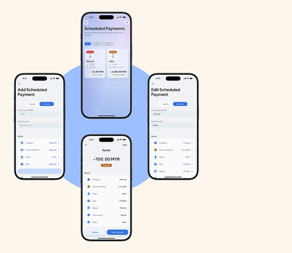
Scheduled Payments
Plan ahead by scheduling one-time or recurring payments, so you never miss a bill again.
4. Helpful Nudges & Progress Insights
SavvyUp keeps you focused on your savings goals with real-time progress tracking, smart nudges, and personalized insights that encourage consistent habits and informed decisions.
Notifications
By delivering updates based on user behavior and financial progress, SavvyUp helps support consistent habits and informed decision-making throughout the savings journey.


Insights
SavvyUp provides users with a data-driven view of their financial journey—highlighting spending patterns, savings progress, and key behaviors—to support smarter, more informed decisions.

DESIGN PROCESS
EMPATHIZE
User Survey
To gain a better understanding of Malaysians’ financial habits, I conducted a survey focusing on individuals who manage their finances across multiple local banks, e-wallets, and fintech platforms. Most respondents were working adults with a majority earning local income and relying on banking apps or budgeting tools to manage their money.
The research surfaced several recurring challenges:
due to the use of multiple banking and e-wallet platforms.
CHALLENGES
Fragmented financial visibility
users face challenges with exchange rates and unclear savings value
Multi-currency challenges
often done mentally or with inconsistent manual methods.
Difficulty tracking savings progress
or accountability due to impulsive spending and unexpected expenses.
Lack of motivation
around linking accounts, including fears of data breaches and unclear data handling.
Privacy and security concerns
These findings informed the development of a key user persona that captures the common goals, behaviors, and challenges faced by the target audience. This human-centered foundation helped ensure the product directly addresses real financial habits and emotional pain points.
User Persona

Empathy Map

User Journey Map

DEFINE
During the Define phase, key research insights were analyzed to pinpoint the main pain points and needs of Malaysian users juggling multiple bank accounts and fintech services. The aim was to develop a cohesive, user-focused solution that streamlines tracking of savings goals, offers clear visibility across various accounts and currencies, and encourages positive saving habits.
Problem Statement

Project Goals
Based on the research findings, the following project goals were established to address users’ key pain points and align the solution with their financial habits and aspirations. These goals guided the design direction to ensure the app delivers meaningful, actionable value to users managing finances across multiple platforms.

-
Allow users to link multiple accounts, cards, and e-wallets to view total balances in one place
Centralize Financial Overview
-
Provide clear insights into income and expenses by category to help users understand where their money goes
Improve Spending Awareness
-
Enable users to set monthly spending limits and receive alerts when they approach their budget caps
Support Smarter Budgeting
-
Introduce scheduled payment tracking to let users stay ahead of upcoming bills and avoid missed payments
Help Plan Ahead
-
Motivate users through personalized insights, gentle nudges, and visual progress summaries to build mindful financial habits over time
Encourage Better Habits
IDEATE
I explored a wide range of possible solutions through sketching, mind mapping, and user flow development. During this phase, I also conducted a competitive analysis of local banking apps, international fintech platforms, and popular e-wallets to identify gaps in multi-account integration, goal tracking, and user engagement strategies.
Competitive Audit
To better understand the fintech landscape, a SWOT analysis was conducted on key competitors including Maybank, Wise, Touch ’n Go, Revolut, Mojek Money, and WalletApp. This helped identify their strengths, weaknesses, and strategic gaps—offering valuable insights into where SavvyUp can stand out.

Key Takeaways:
Competitors like WalletApp offer strong features but often lack simplicity. SavvyUp should focus on a clean, user-friendly design with smart automation to reduce manual input. Revolut and Mojek Money show the value of combining global tools with local relevance—something SavvyUp can build on with multi-currency support and local integrations. Clear data practices will also be key to building user trust. Most importantly, SavvyUp can fill the gap where no app currently offers a unified view of local banks, e-wallets, budgeting, and insights.
How Might We...?

DESIGN
In the design phase, I translated research insights into tangible solutions by first establishing the app’s structure through a sitemap and user flow. I then developed a cohesive brand identity and design system to ensure consistency. Early concepts were explored through sketches and wireframes, which evolved into low-fidelity and high-fidelity prototypes to visualize and refine the user experience.
Sitemap

User Flow

Early Brainstorm and Sketches
I jotted down quick sketches and brainstormed ways the app could solve real user problems. These early sketches allowed me to explore multiple layout options, test feature placements, and refine the app’s core structure early in the design process.

Wireframes & Lo-fi Designs
I translated my sketches into low-fidelity wireframes to define the app’s layout, navigation, and key features. This step helped me validate the structure and user flow before adding visual elements.

Hi-fi Prototypes
With the brand identity and design system in place, I crafted high-fidelity prototypes that reflect the final look, feel, and interactivity of the app.
Design System:
To keep everything aligned, I built a design system that tied together the app’s colors, fonts, and components into a cohesive visual language.

Initial Designs:
My initial designs helped bridge the gap between low-fidelity wireframes and polished UI, allowing me to test key concepts early on.

Final designs:
After rounds of feedback and iteration, I finalized the UI with clear visual hierarchy, accessibility considerations, and a cohesive brand experience.
Additional Screens:
Welcome & Onboarding
The welcome and onboarding flow introduces users to what SavvyUp offers and sets the tone for a streamlined and helpful journey ahead.


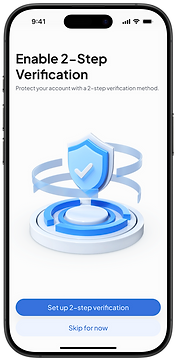
Sign In & Sign Up
SavvyUp offers a smooth authentication experience with strong security measures in place,
so users can log in confidently.


Tab Bar Navigation
SavvyUp’s bottom navigation keeps the experience smooth and accessible, with tabs for Homepage, Insights, Add Cash Input, More, and Me (Profile).


Me (Profile)
The Me page allows users to review personal info, access settings, view statements, and find support when needed.
Light & Dark Modes

TEST
I tested the prototype with users to see how well it held up in real-life scenarios. The feedback gathered highlighted usability issues, feature expectations, and emotional responses that informed critical design revisions. Iteration based on these findings ensured that the final product aligned more closely with user needs and behaviors.
Wireframes & Lo-fi Designs
I followed a top-down design approach using graceful degradation—starting with the desktop web version to establish the full layout and structure. I began the wireframing process by sketching rough layouts in Procreate to quickly explore ideas and structure. These sketches helped me clarify screen flow and user priorities before translating them into cleaner, lo-fi designs in Figma.
REFLECTION
Designing SavvyUp was both a meaningful and eye-opening experience. I set out to make saving and budgeting feel more approachable, especially for users managing multiple accounts and currencies. Through research and testing, I realized how personal and emotional money management can be—and aimed to reflect that in a clean, user-friendly design.
Looking ahead, I’d love to enhance the app with motion and interactive elements to make the experience more fun and engaging. Adding a personalized reward system could also help motivate users to stay consistent and celebrate their savings milestones.
Ultimately, I want SavvyUp to feel like a supportive companion—not just another finance tool. One that motivates, celebrates progress, and helps users build better habits without the pressure.